UX/UI App Design: ‘There’
Overview:
The app ‘There’ is designed to simplify event planning and management while providing a seamless and intuitive user experience. This case study showcases the design process, from research and ideation to prototyping and testing, highlighting the key features and design decisions that address the needs of users who plan or attend events. As the sole designer, I played a crucial role in identifying the problem, crafting the solution, and ensuring a user-centered approach throughout the project.
Project Duration:
January 2023-June 2023
My Role:
Sole UX/UI Designer
Tools Used:
Figma, Sketch, Adobe Creative Cloud, Miro

Goal:
Develop a user-friendly app that empowers individuals to effortlessly create and organize events within groups, while ensuring complete control over their information and privacy. ‘There’ aims to provide a seamless experience where users can enjoy full customization options to tailor their events according to their specific needs and preferences. By prioritizing user control, privacy, and customization, I seek to revolutionize the way people engage in event planning and management, offering a secure and personalized solution for group gatherings.
Design Process
-

Identified a need for an event planning app.
Conducted secondary research, including analyzing social media usage trends and privacy concerns.
Sent out screeners and performed A/B testing to gather insights on user behaviors and preferences.
-

Conducted user interviews to understand common trends, privacy preferences, and communication needs.
Synthesized research findings and identified key insights, such as the importance of privacy, communication, and event information.
Used affinity mapping to categorize and organize user insights and ideas.
-

Developed "How Might We" questions to frame design opportunities based on user needs.
Brainstormed and generated design ideas to address the identified opportunities.
Developed a site map to outline the app's navigation and information architecture.
Created wireframes, sketches, and flows to visualize the app's structure and interactions.
-

Explored various design concepts and approaches for an intuitive event planning and group communication app.
Used Figma and Sketch to create detailed UI designs based on the wireframes.
Created a micro-animated clickable prototype to use for testing.
Conducted usability testing to evaluate the app's user interface and overall usability.
-

Identified areas of confusion or technological flaws through user testing and feedback.
Incorporated user feedback and iterated on the design to improve the app's usability and address the identified issues.
Retested the prototype and continued to improve the usability of the app.
Problem Statement
With the continuous increase in popularity of social media and the growing concern over privacy, users are demanding more control over their privacy, personal information, and content online.
Solution Idea
Create an intuitive event planning and group communication app that prioritizes privacy and user information control in a simple and adaptable way for all users.
Highlights from Secondary Research
Currently, there are 4.89 billion social media users worldwide, projected to grow to 5.85 billion by 2027.
A survey conducted with 1,114 people revealed that 79.2% of respondents adjusted their social media privacy settings in the last 12 months, and nearly 23% deactivated or deleted their profiles due to privacy concerns.

A/B Screener
I created two screeners a multiple choice, and a short answer, to understand user interactions and responses to online content; to see how much effort and time users were willing to spend on their responses. I found that users are more likely to complete the multiple-choice screener due to its quick and easy nature. However, the short answer screener provided more detailed and nuanced responses, despite fewer completions.
I then interviewed 10% of the screener respondents.
Screener Insights
100% of respondents use social media multiple times a day.
60.4% communicate in a group setting online daily.
91.7% prefer having privacy settings on their accounts.
93.8% were invited to an event online three or more times in the past year.

User Interviews
Interview Details:
I recruited 10% of the screener respondents who use social media daily and communicate in group settings online. They completed a 30 min phone interview with me about their personal experiences and preferences online.
(Interview Guide)
Interview Goals:
Identify personal preferences as well as, trends in online social behavior, understand the impact of an audience on behaviors in social media, explore group communication preferences and pain points, and assess the frequency of planning and attending events using group communication.
Key Findings
Participants expressed a preference for a more private online presence with people they know personally.
Participants preferred knowing who else is invited to events before confirming attendance.
Prompt replies and effective communication were deemed important by all interview participants.
100% of participants adjusted their privacy settings in some way to be more private in the past 3 months.
80% of participants have a private story for just close friends and prefer to share content on there over their public story.
What People Are Saying…
“I won’t commit to plans unless I know who else is invited.”
— Interview Participant
“I have a private story to post things only my close friends can see.”
— Interview Participant
“I don’t want people I don’t know seeing what I post.”
— Interview Participant
“I want to keep my life private from my coworkers.”
— Interview Participant
Affinity Map
I created an affinity map from quotes that stuck out to me from the user interviews. I then divided it into six categories: private stories, privacy setting changes, privacy settings, invites/plans, group messaging, and post-removal requests. After doing this I identified common themes and ideas to form insights.
Insights:
Users like to have complete information about events.
Users want to stay updated on current information.
Users desire more privacy and control online.
Users want to keep certain aspects of their life private and share more with close friends.
Users wish to know everyone invited to an event before attending.

Key Design Opportunities From Insights
User-Friendly Hierarchy:
How might we design an app that effectively integrates event planning and group communication, becoming a one-stop solution for users?
Offer a user-friendly interface for event planning and group communication that is simple and quick to use.
Prominently display essential event details.
Provide a range of integrated features to enhance user experience and organization.
Listen, Learn, & Grow from Users:
How might we make "There" a platform that offers a wide range of features and tools to help users plan, organize, and execute events efficiently?
Continuously improve the platform by actively seeking and listening to user feedback.
Create a comprehensive and dynamic tool that caters to various event planning needs.
Understand the needs of different users and provide them with the necessary tools for successful event planning.
Prioritize Privacy and Control:
How might we create a seamless and intuitive event planning experience that prioritizes privacy and user information control?
Give users full control over their privacy and information.
Allow users to control the groups they join, notifications they receive, and the content they publish.
Ensure users know who can see their content within each group.
Simple Privacy Settings:
How might we ensure that the privacy and control features offered by "There" are easy to understand and use for all users?
Provide clear and concise descriptions for each setting.
Implement pop-up notifications to prevent accidental changes.
Use everyday language explanations without technical jargon.
Personas
Site Map
Wireflows
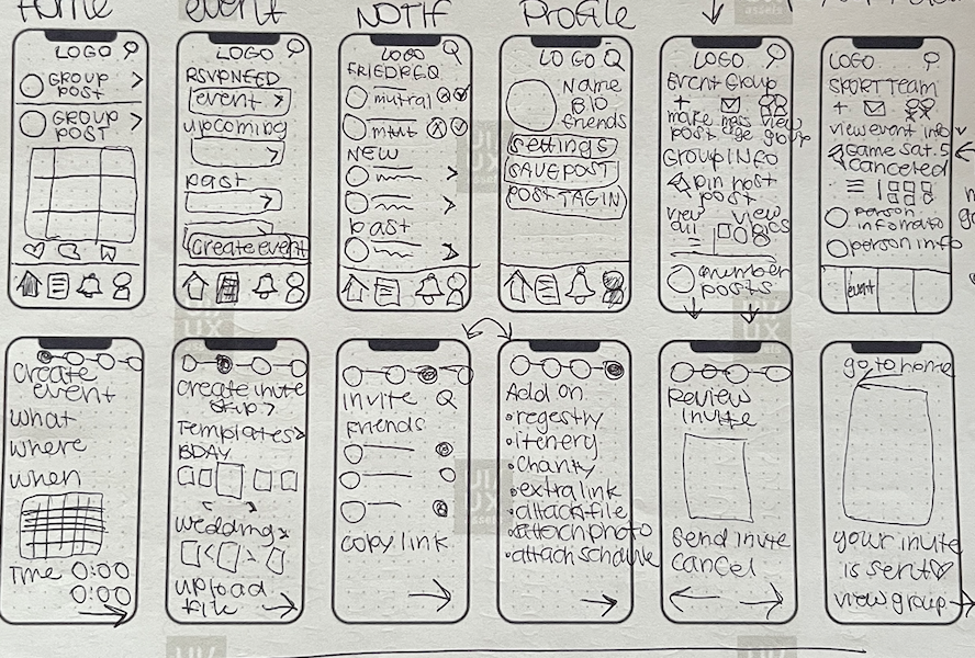
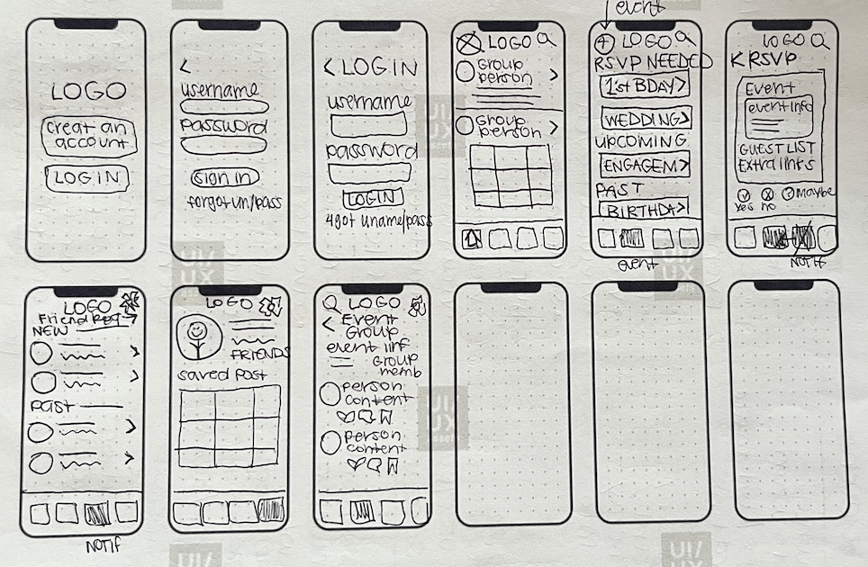
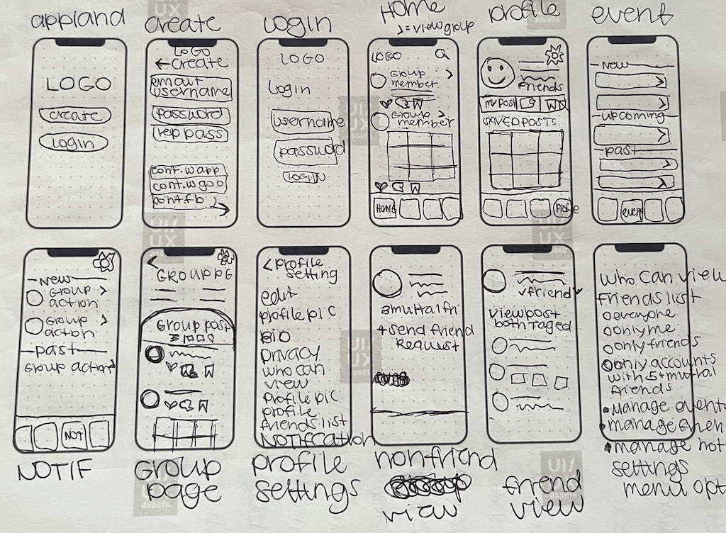
Sketches
Wireframes
From Sketch to High Fidelity
-

Sketch
Event Page
In this screen I wanted the user to be able to view and access all of their events, as well as create a new event.
-

Wireframe
Event Page
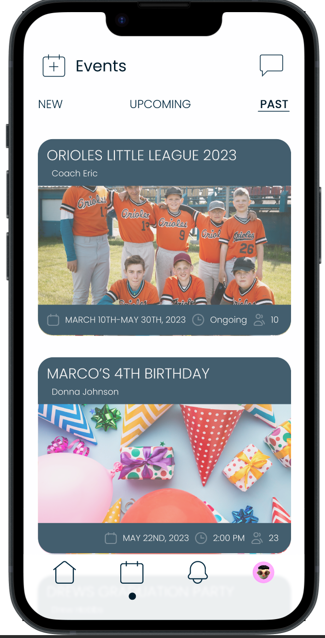
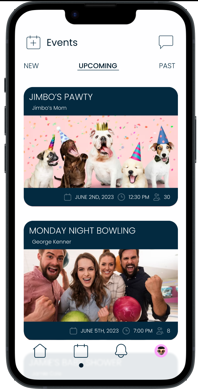
I want users to be able to access important information (date, time, host) quickly without having to click on each individual event.
-

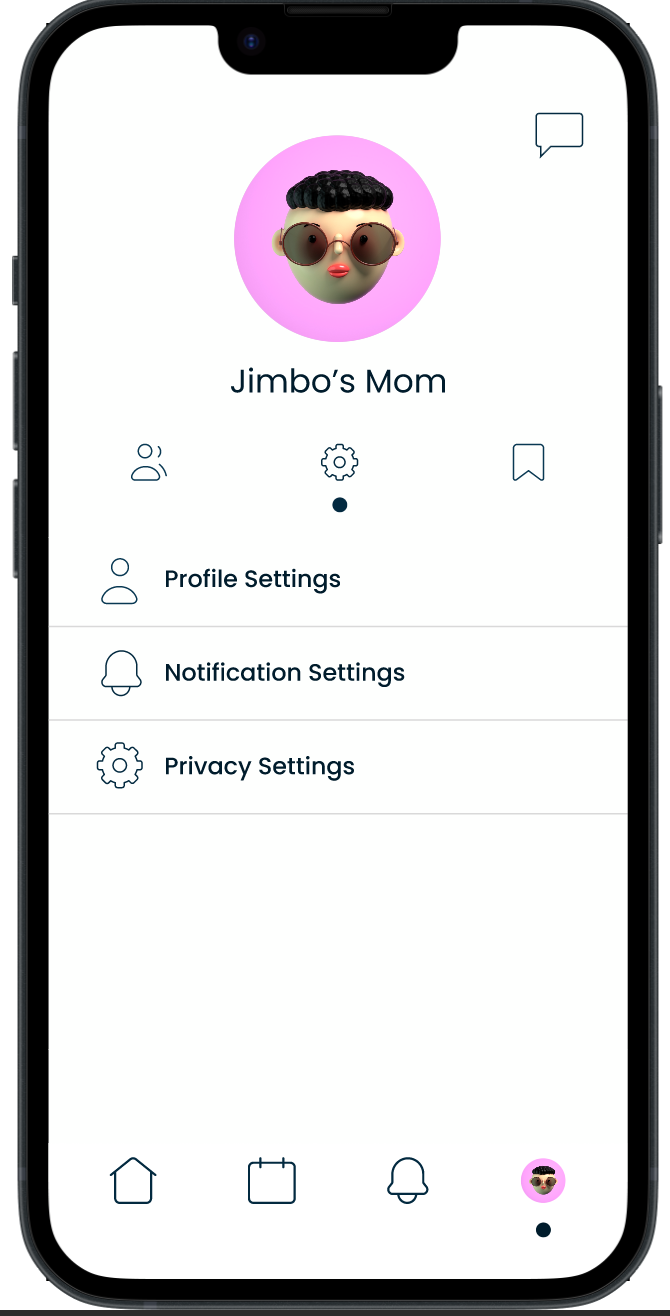
High Fidelity Screen
Event Page
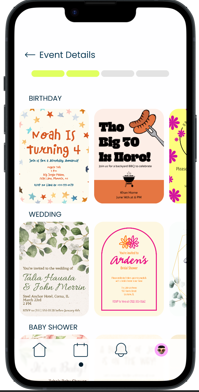
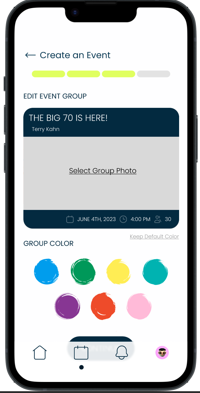
I made each event into a card where users can access information easily. The card also allows the host to further customize their event with a group photo. I also separated the event types into page sections so the user can swipe horizontal to the category they want versus having to scroll down the page.
-

Sketch
Event Group
On the group page, I wanted to showcase group details and posts. Providing a like, comment, and save option for users to interact with.
-

Wireframe
Event Group
I added the group details into a drop-down menu to save space on the screen.
-

High Fidelity Screen
Event Group
I added the group details into a separate menu section that you can click to view providing more space on the screen for user posts without sacrificing content.
High Fidelity Wireframes


Prototype

Usability Tests
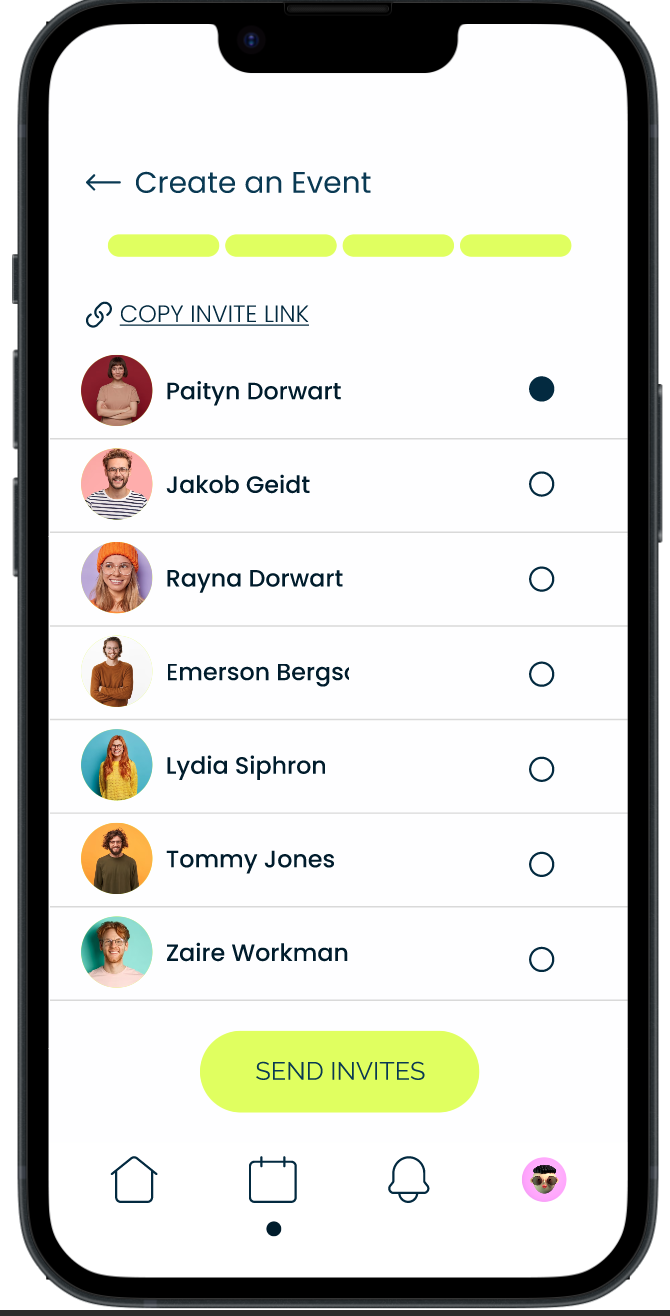
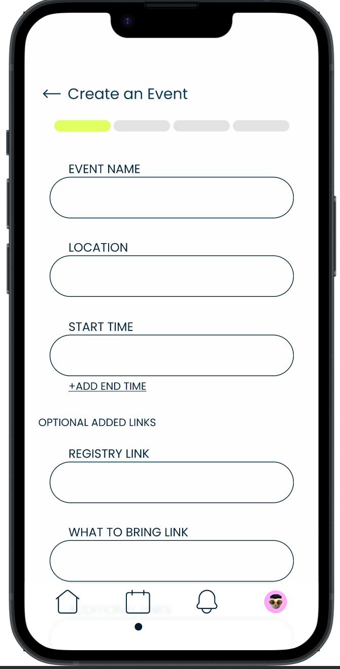
Conducted 5 usability tests to evaluate the user interface and overall usability of the There app. I focused on assessing users' ability to perform key tasks such as creating events, RSVPing, and understanding privacy settings.
Goals:
Assess the overall app navigation, information architecture, and button size.
Gather feedback on the app's visual appeal and user interface design.
Identify any usability issues or challenges users may encounter.
Key Usability Test Findings
Issue: Users were confusing the envelope icon that was used for private messages with an invitation or event icon.
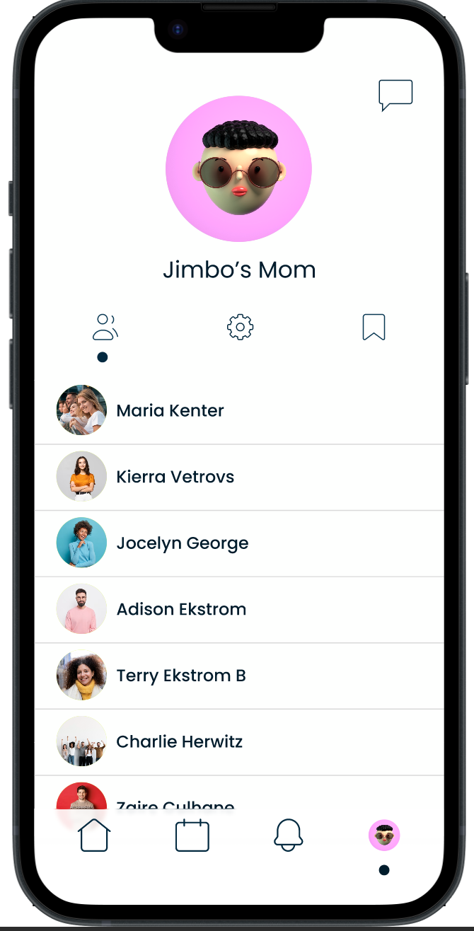
Recommendation: Swap the envelope icon with a chat bubble, a universal conversational icon that does not overlap with an invitation.
Issue: Users were having trouble seeing the difference between new and past notifications.
Recommendation: Make the new notifications more prominent on the screen by fading the past notifications until clicked.

Usability Retest Results
After incorporating the feedback and insights from the initial usability testing, I iterated on the design and conducted a second round of usability testing with 5 new users. The purpose of this testing was to validate the improvements made to the app based on user feedback. The results were highly positive, as all of the users enjoyed the app's simple interface and found it extremely easy to navigate and complete tasks. The customization options offered throughout the app were also well-received, allowing users to personalize their experience. These findings validate the effectiveness of the design changes made and demonstrate the value of incorporating user feedback in the iterative design process. As the app continues to grow and evolve, ongoing testing and user feedback will be crucial in ensuring its usability and user satisfaction.
Prototype
Create an Event
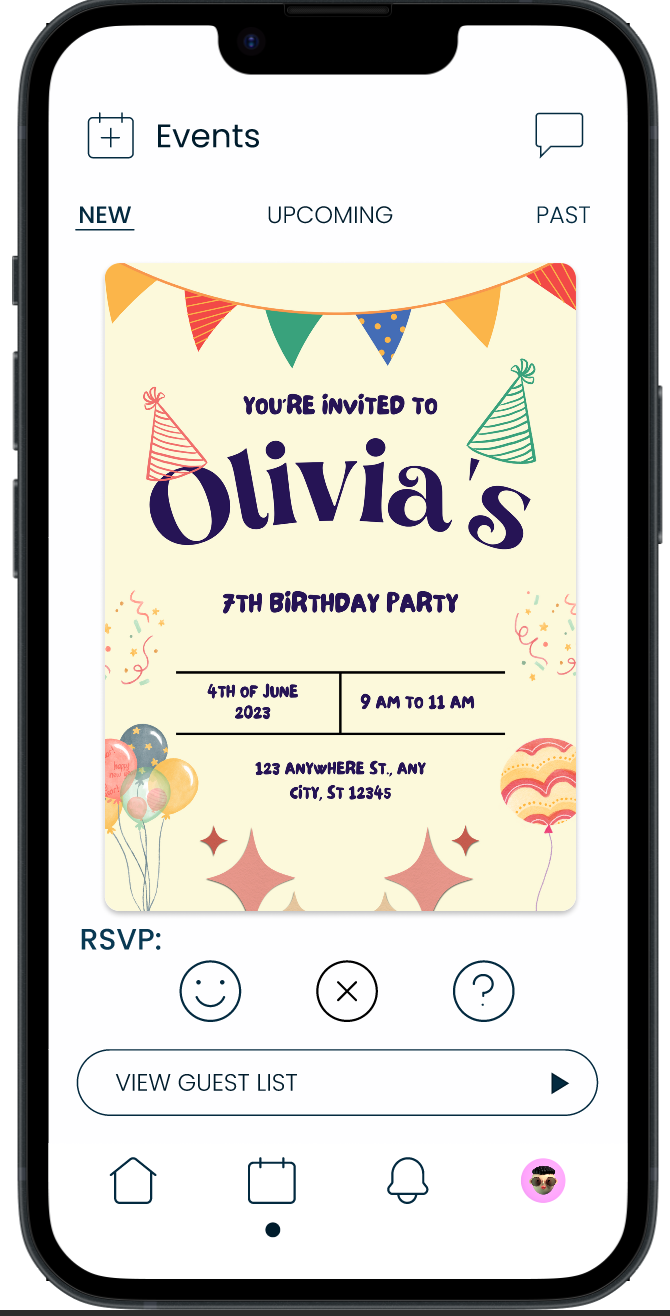
View Guest List and RSVP to an Event
Clickable Prototype

Wrapping up…
This case study has been a transformative journey for me as a UX/UI designer. From ideation and research to user interviews and iterative design, I have gained a deep appreciation for the significance of understanding users' experiences and interactions. By placing users at the center of the design process, I was able to create an app that caters to their needs and offers customization options.
The key takeaway from this experience is the importance of empathy and incorporating user feedback throughout the design process. Actively listening to users and continuously iterating based on their input is vital for creating a user-friendly and intuitive experience.
Moving forward, I will continue refining and expanding the app based on ongoing user feedback. Regular usability testing and user research will be essential to ensure the app remains aligned with user expectations and needs.
Overall, this case study has provided valuable insights and skills in user-centered design. It has reinforced my passion for creating impactful and user-friendly digital experiences. I look forward to applying the knowledge gained from this project to future design endeavors, aiming to create products that truly enhance users' lives.


