Design Sprint: Savr
Overview:
Savr is a new start-up that shares cooking tips and recipes for at-home chefs. Recently, they have been receiving negative reviews about their recipes having too many steps or advanced techniques, making it challenging for users to follow. Users are getting frustrated, especially when they cannot understand the instructions or techniques in the recipe, leading to an unsatisfactory cooking experience.
Project Duration:
5 Days, 40 Hours
My Role:
Sole UX/UI Designer
Tools Used:
Figma, Sketch

Goal:
To enhance the user experience of the Savr native mobile app, we aim to create a new feature that streamlines the process of following recipe instructions. This feature is intended to optimize the accuracy and efficiency of users' cooking experience, ultimately resulting in a more positive app experience.
Design Process
Day 1: Understand and Map
Studied user interviews and pain points.
Created an affinity map to gather insights and design opportunities based on user needs.
Developed a user persona and how might we questions from user insights.
Day 2: Sketch Solution
Evaluated rival applications, examined how they address the requirements and preferences of users, as well as identify areas that could be enhanced.
Did a Crazy 8’s sketch exercise to quickly sketch multiple solution screen ideas.
Combined aspects from my Crazy 8’s sketch to come up with a final solution sketch.
Day 3: Decide and Storyboard
Decided on my final solution.
Developed a site map to outline the app's navigation and information architecture.
Created wireframes, and storyboards to visualize the app's structure and interactions.
Day 4: Prototype Solution
Explored various design concepts and approaches that offered users a better cooking experience.
Used Figma to create detailed UI designs based on the wireframes.
Created a micro-animated clickable prototype to use for testing.
Day 5: Validate
Conducted usability testing to evaluate the app's user interface and overall usability.
Identified areas of confusion or technological flaws through user testing and feedback.
Incorporated user feedback and iterated on the design to improve the app's usability and address the identified issues.

Day 1: Understand and Map
Design Constraints
Currently, recipes are written as text in ordered steps from start to finish.
The solution should be designed as a feature for the native mobile app.
Focus on creating a better experience for users when it is actually time to cook.
Users do not struggle to find quality recipes they struggle when it becomes time to execute them.
Problem Statement
Users of the Savr app feel unprepared, rushed, and confused while following recipes, leading to a negative cooking experience. They struggle with managing time, understanding complex steps, and keeping track of their progress, resulting in meals that don't turn out as planned.
Solution Idea
Provide clear timing, comprehensive preparation, simplified instructions, and a progress tracking system to help users confidently follow recipes, enjoy the cooking process, and achieve successful outcomes.
What people are saying…
-

“I like to be ready for the next few steps. Sometimes I'll be standing around waiting, and it's not until later that I realize I could've saved 20 minutes by starting on something else."
-Lindsey
-

“Sometimes I feel like steps are sprung on me...and that turns an enjoyable experience into a stressful one. I like to be as prepared as I possibly can be before I start cooking things that I can't undo."
-Anna
-

“I can see what the finished product looks like, but I don't know if I'm on the right track halfway through...is it supposed to look like this? If not, it's better to know sooner rather than later."
-Dan
-

"I know the basic definitions like, what minced Garlic should look like. But a lot of times I see techniques that I am totally unclear on. I google image search or youtube it, which kind of throws everything off and, means needing to drop what I'm doing to use my phone."
-Tony
Affinity Map
I created an affinity map from quotes that stuck out to me from the user interviews and quotes. Then identified three common themes Unclear Instructions/Unprepared, Timing, and Learning New Techniques.
Insights:
Users want recipes to be timed to ensure everything is finished at the same time.
Users desire the total time of a recipe to include both preparation and cooking time.
Users feel unprepared and stressed when a step is introduced during cooking that could have been completed ahead of time.
Users want to know in advance what kitchen tools they will need throughout the entire recipe.
Users seek a way to track their progress and anticipate upcoming steps to avoid missing any complex recipes.
Users dislike the need to refer to their phones repeatedly for unfamiliar steps or cooking methods.
Users often struggle with performing complex steps and cooking techniques.
Key Design Opportunities From Insights
Synchronized timing: a way to ensure that all components of a recipe are finished at the same time.
Comprehensive-time estimation: total time of a recipe, including both preparation and cooking time.
Pre-preparation guidance: clear instructions in advance for tasks that can be completed ahead of time.
Clear instructions on complex steps and methods: clear and concise instructions, including visual aids if possible, to understand and perform complex cooking steps and techniques accurately.
Step tracking and progress visibility: a way to track their progress, know which steps they have completed, and have visibility into upcoming steps, particularly in complex recipes.
In-app guidance and reference: access instructions and cooking methods within the app itself, without having to constantly refer to their phones or external sources.
Upfront kitchen tool information: know in advance what kitchen tools and utensils will be required throughout the entire recipe.
Persona

How Might We Questions
HMW ensure synchronized timing in recipes?
HMW provide comprehensive time estimation for recipes?
HMW help users better prepare and pre-plan their cooking process?
HMW present upfront information about required kitchen tools and utensils?
HMW design a step tracking and progress visibility feature in recipes?
HMW offer in-app guidance and references without requiring external sources?
HMW provide clear instructions and visual aids for complex cooking steps and techniques?
Day 2: Sketch Solution
Tasty
-
Video examples of steps shown and repeated until task is done
Adjustable serving size
Has a step by step mode
User photo examples of the recipe
Progress bar
-
Messy interface have to scroll down far to cook mode and recipe instructions
Does not include a kitchen supplies list
Competitor Analysis
Food Network
-
Cooking Classes to learn different cooking skills
Shows active and total time
Side menu of recipe steps to skip ahead or go back steps
Set timer section that starts a timer in the app
Progress bar
Cook mode with photos
Simple clean easy to use interface
-
No videos in the cook mode so users need to go to the cooking class section if they need to learn how to use a new skill
No kitchen supplies list
Not all recipes have cook mode
Yummly
-
Guided recipes
Seconds recipes where the cook times them self cooking the recipe to show total time taken
Has kitchen supplies list
-
You have to be subscribed to view guided recipes
Some recipe instructions are not written in the app the app takes you to an external website or blog to view recipe
You cannot pause, rewind, or skip ahead the seconds cooking videos
Crazy 8 Sketches
During the Crazy 8 exercise, I identified Screen 8 as the most critical screen. This decision was based on the fact that towards the end of the exercise, I encountered challenges in generating new and creative ways to organize the screen content. As a result, for the final screen, I decided to consolidate various elements that I found appealing from my previous screens.
The aspects I incorporated from earlier screens include:
Utilizing half of the screen for a prominent photo (inspired by Screens 1, 3, 4, and 6).
Implementing a progress bar to track the user's progress (inspired by Screen 6).
Including a timer feature to help users manage cooking time (inspired by Screens 4 and 6).
Incorporating a pro tip to provide additional guidance and helpful insights (inspired by Screen 4).
By combining these elements onto Screen 8, I aimed to create a comprehensive and visually appealing interface that incorporates the best aspects from earlier screens.
Solution Sketch
Based on the user research and persona, the following insights were my focus in designing the new feature:
1. Show timing on recipes to help users stay true to time while cooking.
2. Organize recipe content to efficiently prepare users for a recipe.
3. Provide a tool that allows users to see the current, past, and future steps of a recipe.
4. Provide users with all the information and skills needed for each step of the recipe
Day 3: Decide and Create a Storyboard
Wireframes

Design Solution
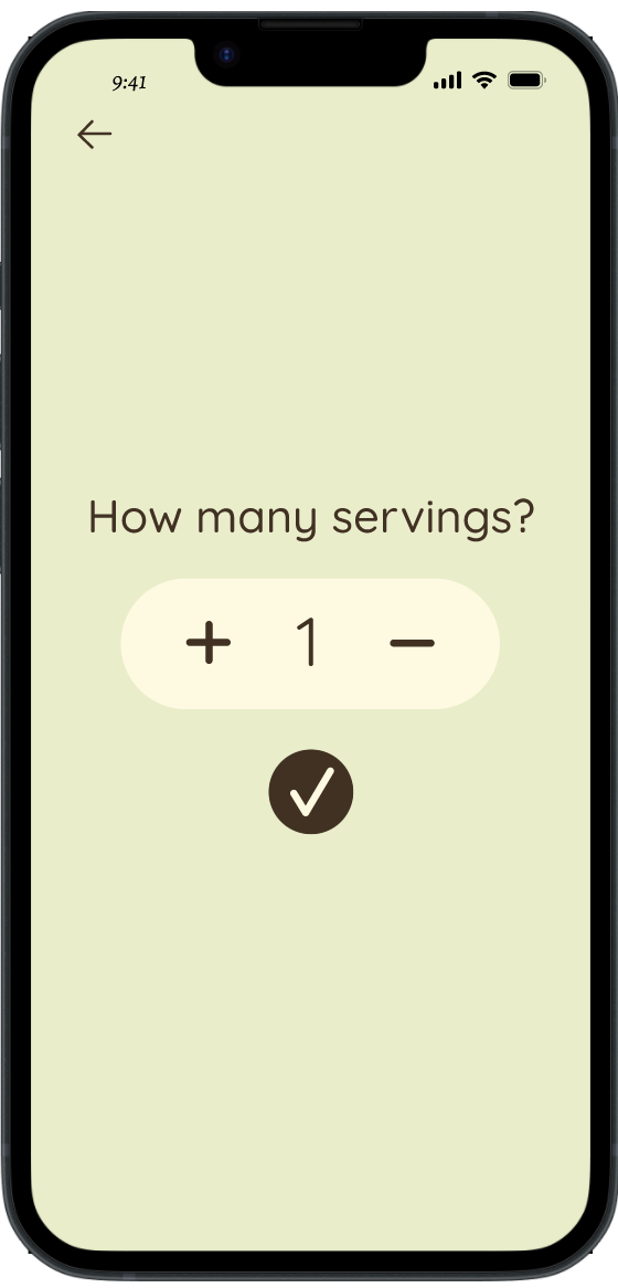
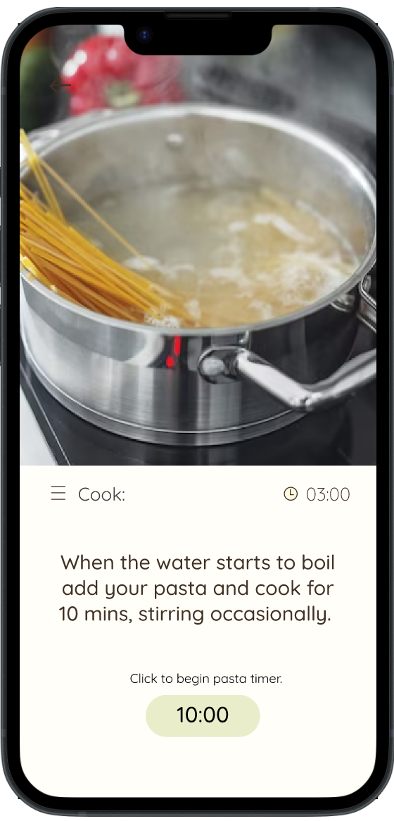
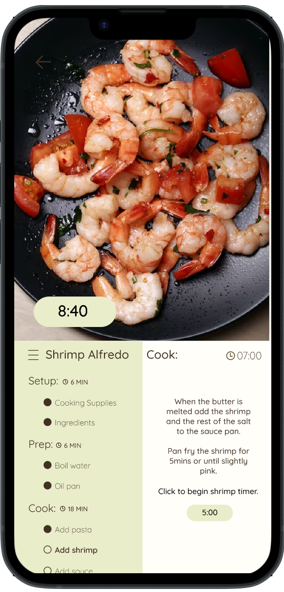
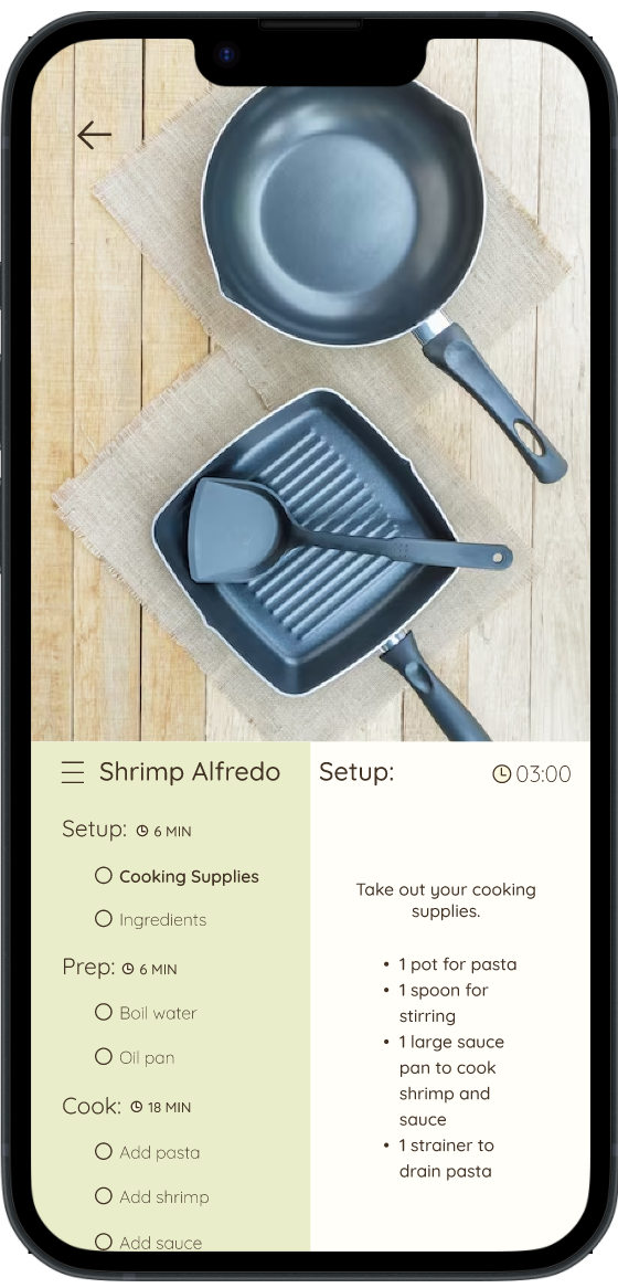
The proposed solution is to create a 'Cook-A-Long' feature in the Savr app, which allows users to cook along with the app. This feature aims to prepare users, keep them on track with instructions, and eliminate the need to leave the app for timers or additional guidance. The feature will include…
Three main sections: setup, prep, and cook.
Users can track their progress and preview upcoming steps through a side hamburger menu.
Each step will be presented with a visual example and a description of how to complete the step.
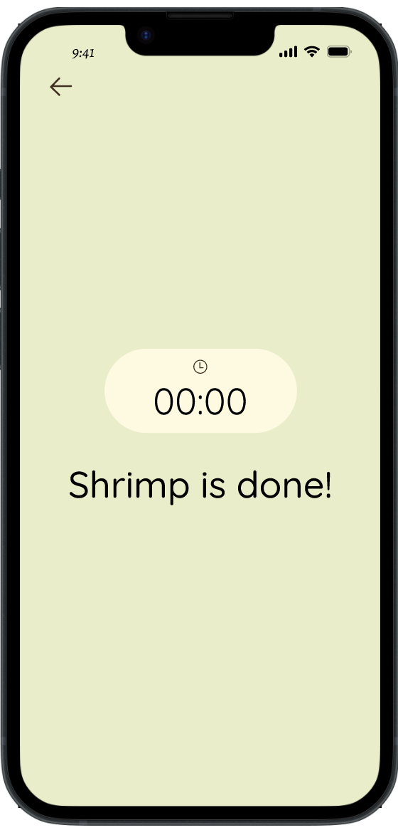
Timed steps will include a timer button that users can start and monitor within the app.
Each section will provide an estimated time to help users pace themselves to stay on track.
In the written instructions, users can click on a step to open it in the Cook-A-Long feature for a quick visual guide. Providing the user with a quick visual aid if they prefer to view written instructions but get stuck on a step.
Day 4: Prototype Solution
From Sketch to High Fidelity
-

Sketch
Recipe Page
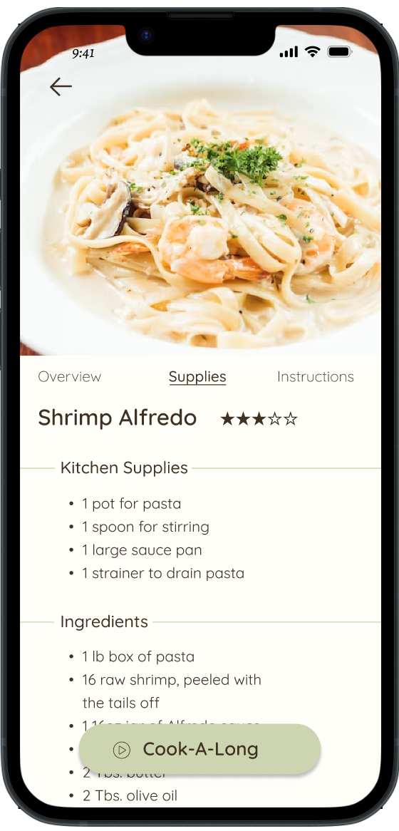
In this screen I wanted the user to be able to view and access all of the necessary information needed to successfully make the recipe.
-

Wireframe
Recipe Page
I created a clear hierarchy in the text making the information easy to locate.
-

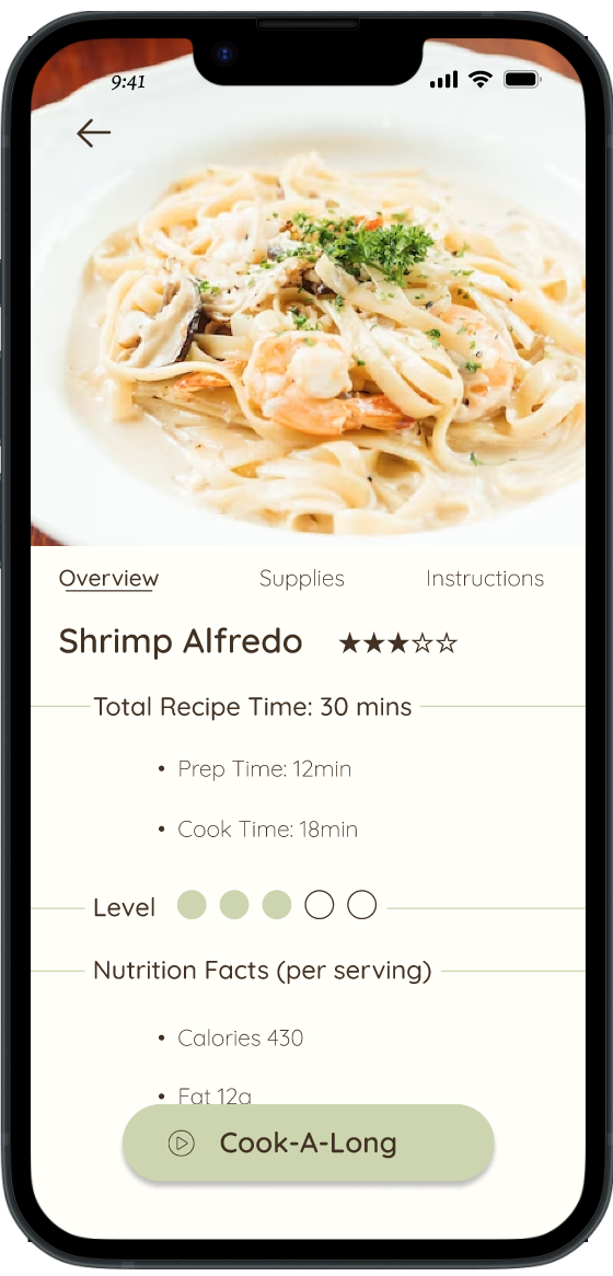
High Fidelity Screen
Recipe Page
Due to recommendations from usability testing, I moved the ‘Cook-A-Long’ button from the right corner and enlarged it. This made the feature stand out more to users.
-

Sketch
Cook-A-Long Page
In the Cook-A-Long screen I wanted to include visual aids to assist users throughout their cook. I also provided a time estimate of each step and a hamburger menu with steps so users can keep track of their cook.
-

Wireframe
Cook-A-Long Page
I made the visual aid take up over ½ of the screen and list one step at a time. By keeping information minimal on the screens it allows users to quickly glance at their phone and locate necessary information
-

High Fidelity Screen
Cook-A-Long Page
I wanted to keep the final screen as minimal as possible to keep users focused on what they are cooking and eliminate unnecessary distractions.
High Fidelity Screens


Prototype
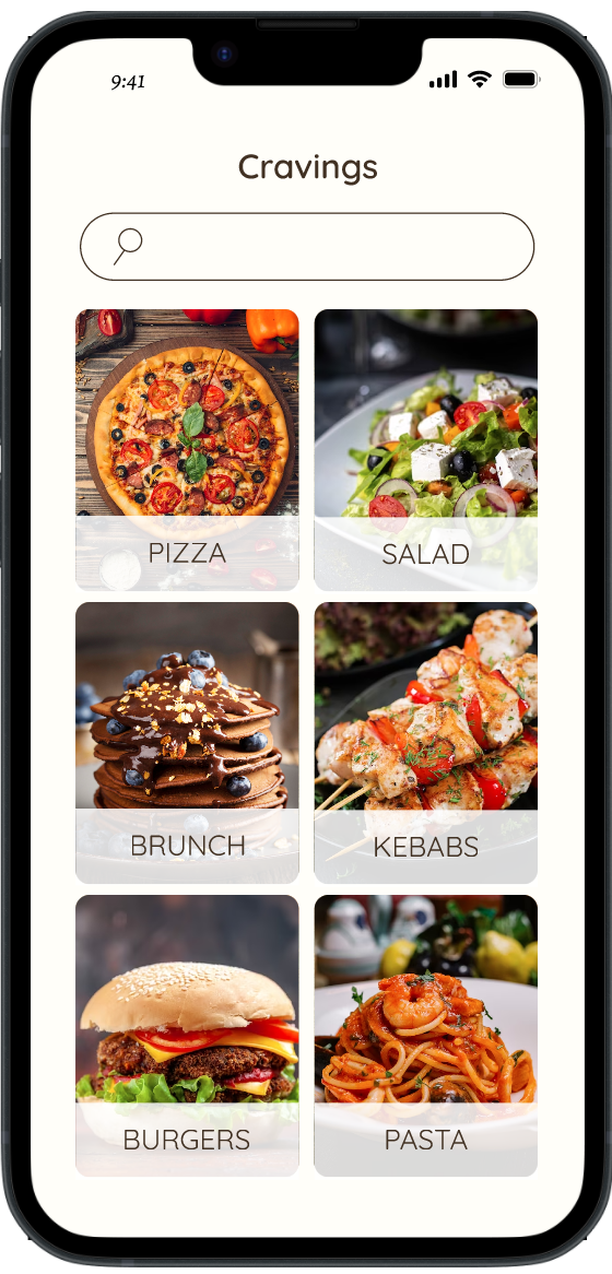
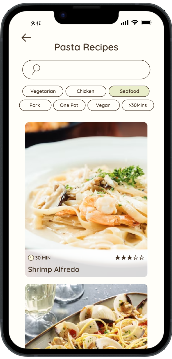
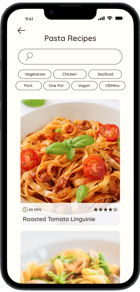
Finding a recipe
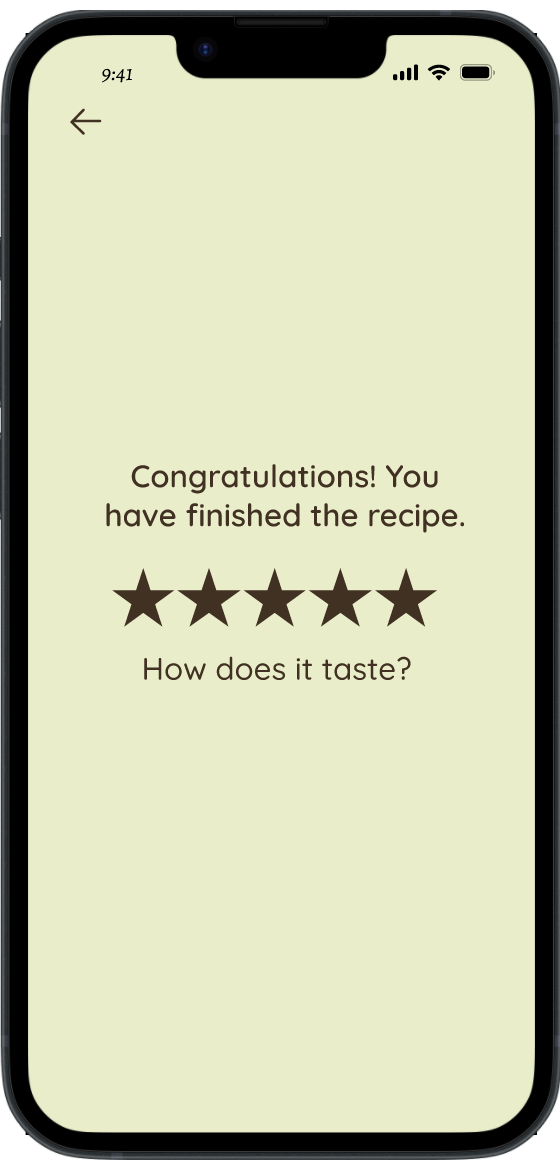
Using the Cook-A-Long feature
Going from written instructions to the Cook-A-Long feature step
Clickable Prototype
Day 5: Validate

Usability Test
Five participants were interviewed to assess the usability and effectiveness of the new Cook-A-Long feature. They were instructed to use the app as they normally would to prepare a Shrimp Alfredo dish. During the testing session, their interactions with the app were observed, and notes were taken regarding their usage patterns, areas of success, and challenges encountered. I focused on assessing users' ability to locate and successfully complete a recipe.
Goals:
Assess the overall app navigation, information architecture, and button size.
Gather insight if users prefer written instructions, or the Cook-A-Long feature.
Identify any usability issues or challenges users may encounter.
Recommendations From Usability Testing
Issue: Users were going to the written suggestions instead of choosing the Cook-A-Long feature. When asked why all three users said they did not see that as an option.
Recommendation: Relocate and enlarge the button making it more visible to users.
Issue: Users voiced they would not want to have to touch their screen for every step.
Recommendation: Change the step time estimate to a timer that counts down while the step is being completed. and automatically move on to the next step so users do not have to click through each step. If a user falls ahead or behind. They can still swipe freely back and forth through the steps as they please.
Usability Retest Results
Key Findings:
1. App Usage and User Experience:
Participants found the app intuitive and easy to navigate, allowing them to complete the task with relative ease.
3 users chose to use the written instructions instead of the Cook-A-Long section. When asked about their decision they were unaware of that option.
2. Feedback and Suggestions:
Participants expressed positive feedback about the app's overall functionality and convenience.
When asked about potential improvements, users provided valuable suggestions such as using voice activation, timed screens to minimize phone usage while cooking, increase the visibility of the Cook-A-Long button.
Based on the user testing results, it can be concluded that the app performed well, offered a positive user experience and all five users were able to complete the task successfully. However, there are opportunities for improvement, particularly in terms of clarifying the purpose and visibility of certain design elements. The feedback and suggestions provided by the participants will be used to refine and enhance the app's usability and user interface.

Wrapping up…
In conclusion, this design sprint provided an invaluable opportunity for me to rapidly gather customer insights, develop designs, and conduct tests. The fast-paced nature of the sprint prevented second-guessing and allowed me to focus on a single solution that I could iterate and build upon. Given more time to refine this feature, I would further enhance its functionality by incorporating voice control and introducing an option for users to cook multiple recipes simultaneously in the Cook-A-Long feature. This would eliminate the need to navigate in and out of recipes when preparing multiple dishes, providing a seamless and efficient cooking experience.


